Pinch A Penny
The Pinch A Penny Digital Transformation: A Story of Design and Impact
Overview
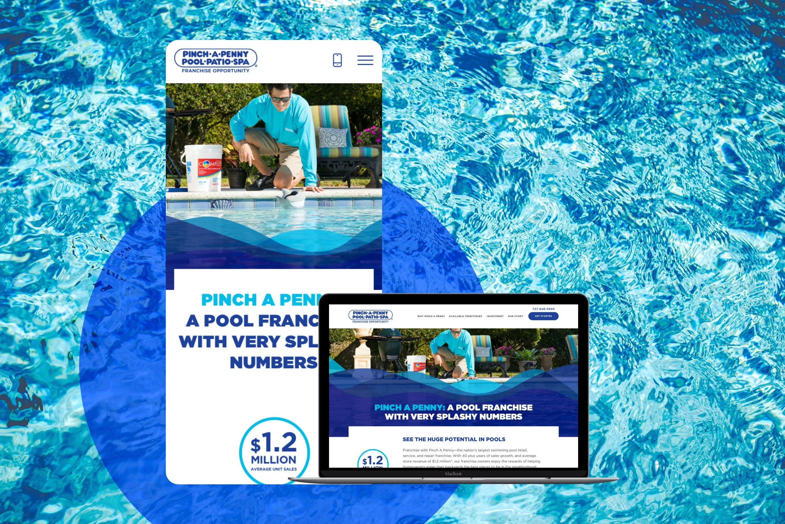
Pinch A Penny transformed its website with a mobile-friendly design, improved storytelling, and intuitive navigation, making it easier for potential franchisees to explore opportunities. The redesign increased engagement, streamlined the user experience, and strengthened the brand’s digital presence.
INDUSTRIES
Pool & Spa Retail
Franchising
ROLE
Senior UX/UI Designer
DISCIPLINES
UX / UI
Brand Identity
TIMELINE
2019
TOOLS
Sketch
InVision
A Legacy Worth Celebrating
Back in 1975, a small swimming pool business sprouted in Clearwater, Florida. Over the years, Pinch A Penny blossomed into the nation’s largest swimming pool retail, service, and repair franchise, with more than 250 stores and a solid reputation for quality. By 2020, it proudly landed in Entrepreneur Magazine's Franchise Top 500.
But even the most established brands can fall behind. Pinch A Penny’s digital presence, while functional, struggled to keep up with the expectations of mobile-first entrepreneurs and family-focused business professionals. The site was static, the lead form unresponsive, and the message? It didn’t shine through.
It was clear: Pinch A Penny needed more than just a facelift, they needed a web experience that mirrored their leadership in the industry.
The Problem: A Tale of Two Devices
Pinch A Penny’s audience was already active, with most web traffic coming from mobile devices. But there was a hitch: the unresponsive design turned potential leads away. Mobile users were deferring their journey to desktop, a delay that no brand wants.
Even worse, the site’s story wasn’t being told effectively. Their rich legacy, franchisee testimonials, and compelling value proposition were hidden beneath a dated design and lack of concise messaging. It was like a treasure chest with a rusty lock, valuable but inaccessible.
Designing the Future: From Vision to Blueprint
When Pinch A Penny decided to reinvigorate their digital presence, the goal wasn’t just to modernize but to elevate. The mission was clear:
Make the site mobile-friendly and user-focused.
Highlight what makes Pinch A Penny unique, from franchisee success stories to brand credibility.
Simplify the path to the customer lead form while keeping engagement high.
With this in mind, the design journey began.
Wireframes: Setting the Foundation
Every great design starts with a solid blueprint.
Mobile and desktop wireframes were created to map out the user experience. These served as the skeleton for the site, ensuring that every button, section, and image had a purpose.
Collaboration was key.
The wireframes were shared with stakeholders, and their feedback shaped the initial draft into something more refined. Adjustments were made to improve flow and emphasize clear calls to action, each tweak bringing the vision closer to life.
High-Fidelity Prototypes: Breathing Life Into the Design
Once the wireframes were approved, the design shifted into high gear. Using Sketch, high-fidelity prototypes for both mobile and desktop were developed. This phase brought the website’s visual identity into focus, with modern branding, clean layouts, and custom photography taking center stage.
Engaging statistics were woven into the design, reinforcing Pinch A Penny’s credibility. Testimonials from franchise owners added authenticity, while animations brought the site to life without overwhelming users. Each iteration was a step toward perfection, refined by stakeholder input.
The Launch: Turning Vision Into Reality
The revamped website was a culmination of strategic design and thoughtful storytelling. With a responsive design in place, potential franchise owners could now seamlessly explore opportunities on mobile or desktop. Clear calls to action guided users toward the lead form, while intuitive navigation made it easy to find territories available for franchising.
Results: A Splash of Success
Since the launch of the Pinch A Penny Pool Patio Spa website in 2020, the brand has seen significant franchise growth, expanding from 254 locations to over 293 by 2024, an increase of 39 new franchises (14% growth).
The impact was undeniable.
User engagement, session duration, and overall web traffic surged across all devices. What was once a fragmented and outdated digital experience became an intuitive, seamless journey that truly resonated with Pinch A Penny’s audience.
Mobile users no longer hesitated.
With a beautifully designed, high-performing site, they could quickly access the information they needed, making decisions with confidence and ease.
Lessons Learned: The Dance of Collaboration
The project wasn’t without its challenges. One of the biggest takeaways was understanding that design is a partnership. While agencies can move at lightning speed, clients often operate at their own rhythm. Aligning those paces is like a potato sack race, success depends on moving in unison.
But with patience, collaboration, and a clear vision, Pinch A Penny’s digital story was rewritten into one of growth and possibility. Their new web experience now stands as a testament to what thoughtful design can achieve.
And for the entrepreneurs browsing the site, it’s no longer just a website, it’s an invitation to dive into their own franchise journey.


