RiverSource
The Rebirth of RiverSource.com: A Legacy Reimagined
Overview
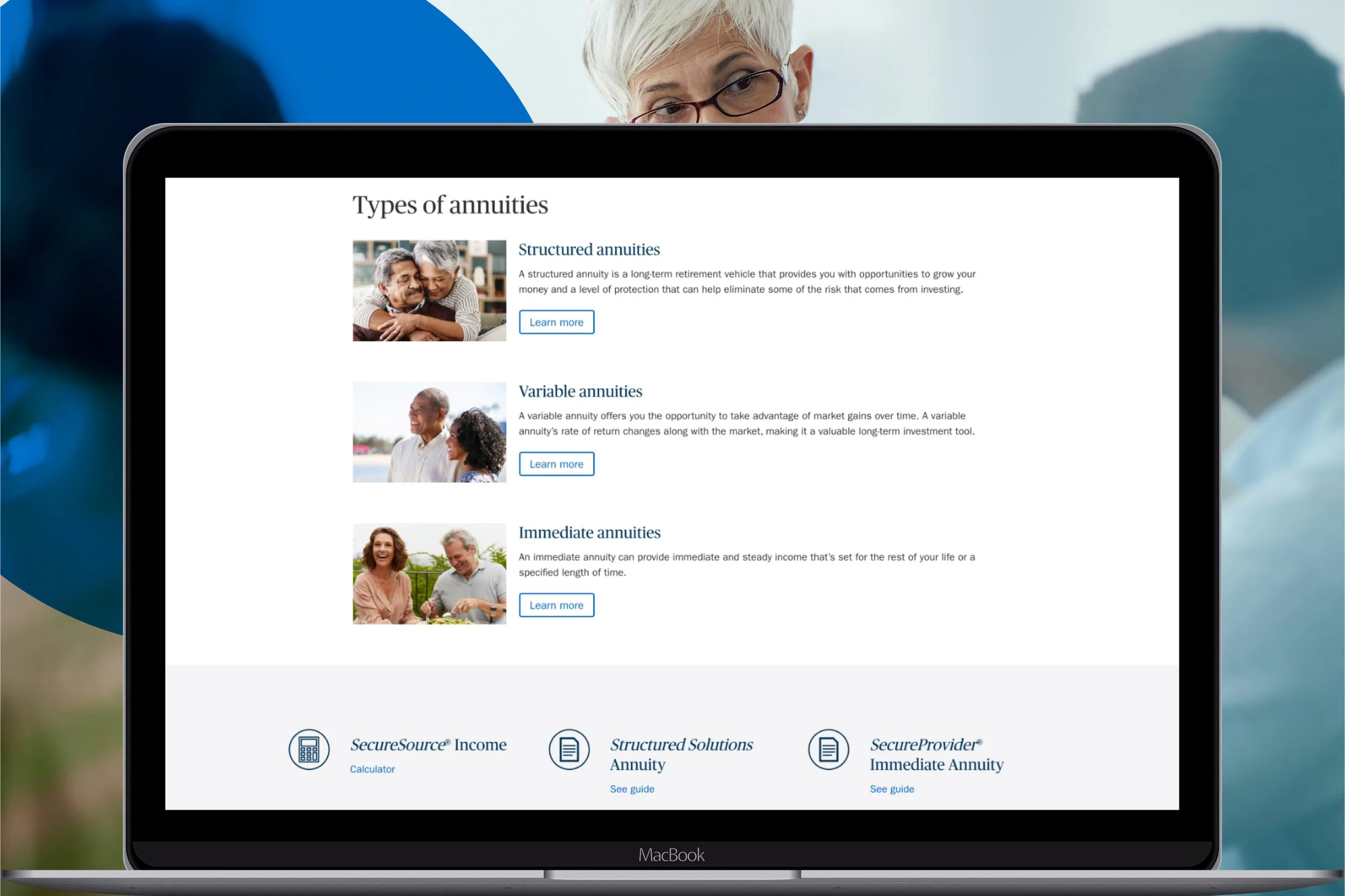
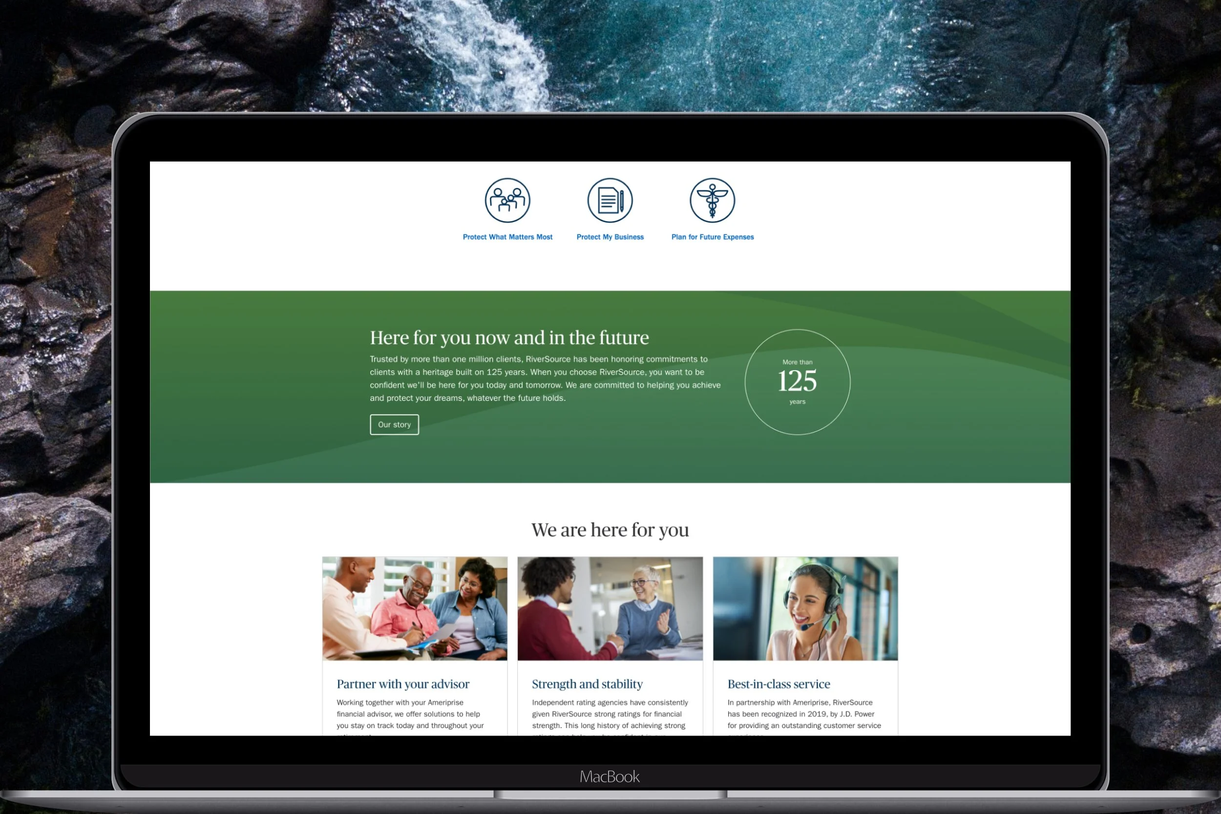
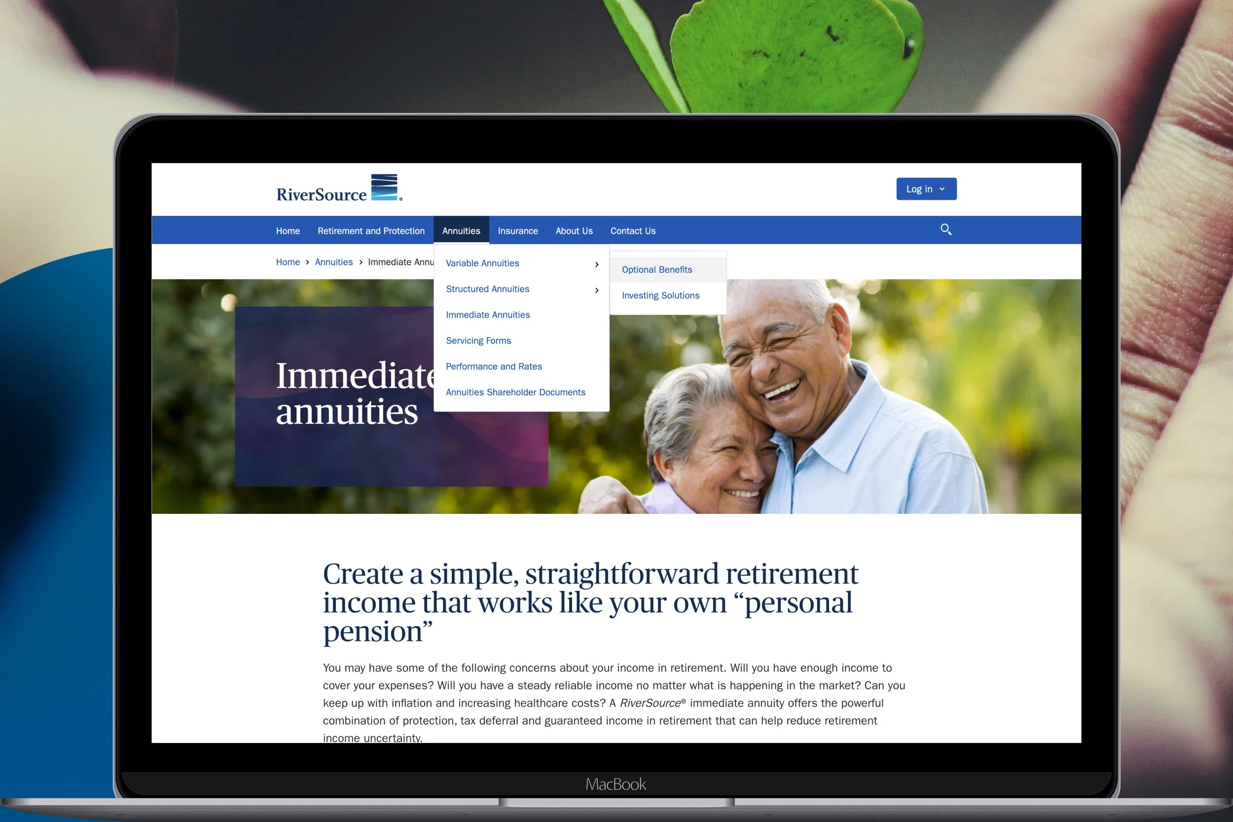
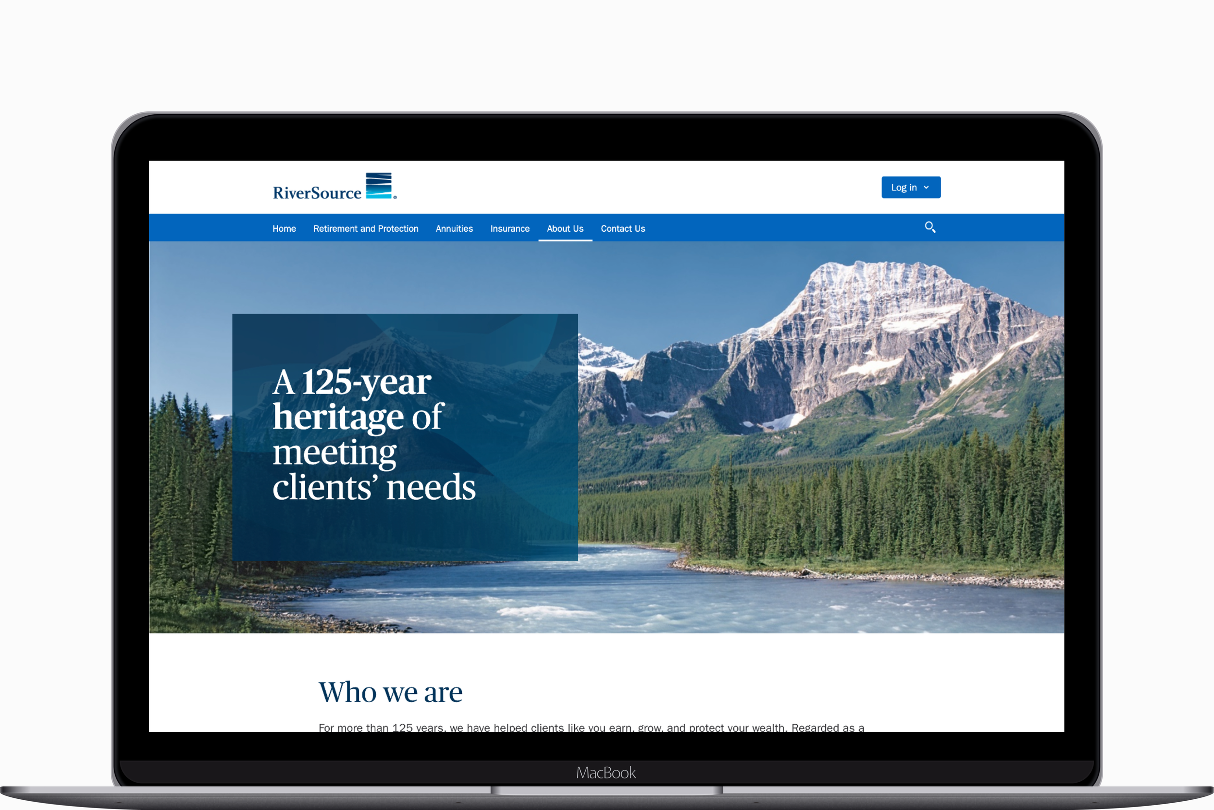
RiverSource.com underwent a complete transformation to modernize its outdated design, improve accessibility, and enhance user experience.
Through research-driven strategy, streamlined content, and accessibility-first design, the new site revitalized the brand’s digital presence, setting the stage for increased engagement and long-term growth.
INDUSTRIES
Financial Services
Insurance
Annuities
Investment Products
ROLE
Product Designer
DISCIPLINES
Brand Identity
UX / UI
TIMELINE
2020
TOOLS
Sketch
InVision
A Century of Trust, A Decade of Stagnation
For over 125 years, RiverSource has stood as a beacon of financial security, offering annuities and life insurance products that help clients reach their goals. But by 2020, its flagship B2C website, once a leader in its space had fallen behind.
With branding that hadn’t aged gracefully and an experience that lacked the clarity and modernity today’s users expect, RiverSource.com was no longer pulling its weight. Site traffic had been steadily declining for years, and the legacy content had grown cumbersome, failing to meet the evolving needs of users. Worst of all, the site was not compliant with WCAG 2.0 standards, leaving key audiences underserved.
It was time to rebuild RiverSource.com from the ground up.
The Challenge: More Than a Makeover
At its core, this was more than a redesign, it was a reinvention. The challenge wasn’t just about creating a visually appealing site; it was about addressing:
Declining Traffic: Numbers had been dwindling year-over-year, with March traffic dropping from over 20,000 in 2018 to just 11,638 in 2020.
Outdated Design: The branding hadn’t been updated in nearly a decade, leaving the site feeling dated and disconnected from RiverSource’s modern rebrand.
Overwhelming Content: Legacy content and product information were too complex, confusing users instead of guiding them.
Accessibility Gaps: The site didn’t meet essential WCAG 2.0 standards, creating barriers for many users.
A Fresh Vision: Setting the Foundation
The solution began with rethinking the website’s purpose and its audience. We started by identifying key demographics and crafting a user-first approach to navigation, design, and content.
Our guiding principles were:
1. Reimagine the Experience: Align the site with modern digital brand principles to create a cohesive, polished feel.
2. Simplify and Clarify: Refine content strategy and product information to make the site more navigable and user-friendly.
3. Modernize Accessibility: Ensure full compliance with WCAG 2.0 standards to provide an inclusive experience for all users.
Discovery: Analyzing the Landscape
To inform our design, we dove deep into research and analysis.
Competitive Analysis: I assisted in a thorough review of competitor sites, identifying both strengths and gaps that we could capitalize on.
Tools and Calculator Audit: RiverSource’s suite of tools and calculators was outdated and cluttered. I led an audit, providing actionable recommendations to streamline and modernize these offerings.
User Flows and Sitemap: We restructured the entire user journey, ensuring intuitive flows that guided users seamlessly from discovery to action.
Execution: From Concepts to Creation
Wireframes and Prototypes
Starting with sketches and low-fidelity prototypes, we mapped out a framework for the new site. Each iteration was refined through feedback from stakeholders, ensuring the design aligned with RiverSource’s goals.
High-Fidelity Mockups
This was where the site truly came to life. Using tools like Sketch and InVision, I created detailed mockups that captured the essence of the RiverSource brand while emphasizing functionality and accessibility.
Key design decisions included:
Modern Visual Hierarchy: A clean, structured layout that made information easy to find and digest.
Subtle Branding Cues: Integrating RiverSource’s refreshed branding in a way that felt natural and cohesive.
Accessibility-First Design: High-contrast colors, readable fonts, and thoughtful interaction patterns ensured the site met WCAG standards.
The Results: A Legacy Renewed
The new RiverSource.com launched on time and within budget, marking the start of a new chapter for the brand.
Clear and Modern Messaging: Prospective clients could now easily explore RiverSource’s full suite of offerings, with messaging that inspired trust and clarity.
Increased Engagement: While I wasn’t able to track post-launch analytics, the refreshed design laid the groundwork for boosting user engagement and reversing the trend of declining traffic.
Scalable Impact: The lessons learned and principles established during this project influenced RiverSource’s other digital products, creating a ripple effect across the organization.
Lessons Learned: Designing Beyond the Screen
This project was more than a website redesign, it was a puzzle with many moving pieces. Here’s what I took away:
Think Big Picture: Solving immediate problems is important, but always consider how those solutions fit into the larger ecosystem.
Collaboration Is Key: Our cross-functional team thrived on trust and open communication, leveraging each other’s strengths to create something greater than the sum of its parts.
Celebrate the Process: Every iteration, every critique, and every brainstorm brought us closer to the final product. Success lies in the journey, not just the destination.
RiverSource.com now stands as a testament to what happens when thoughtful design meets purpose-driven innovation, proof that even after 125 years, a legacy can continue to evolve.


