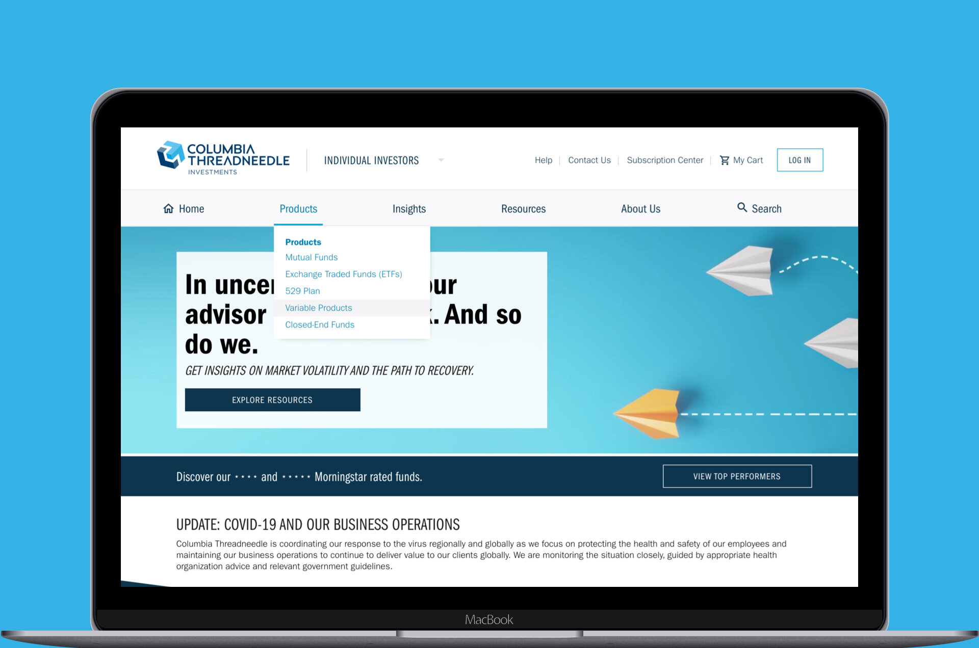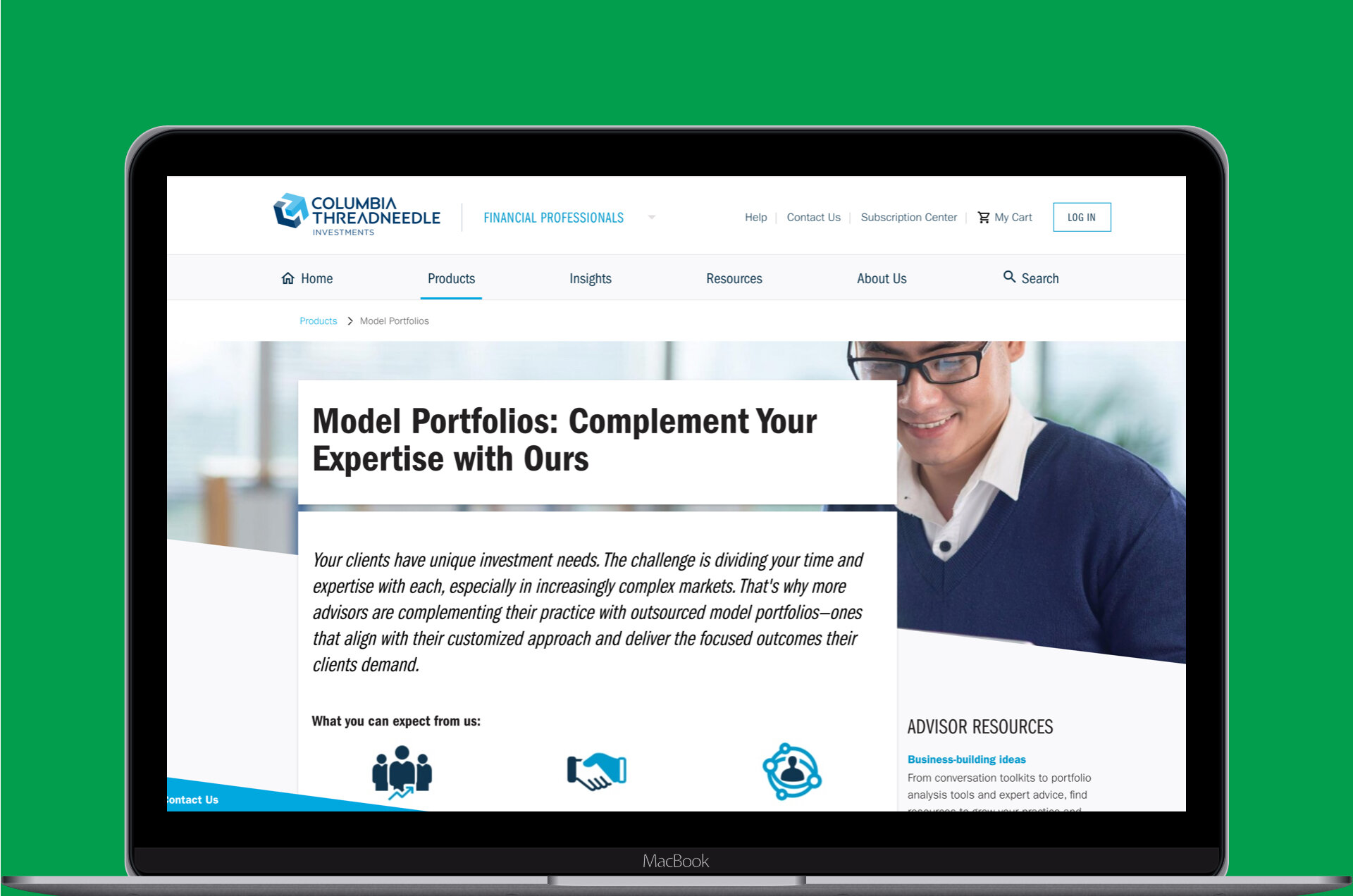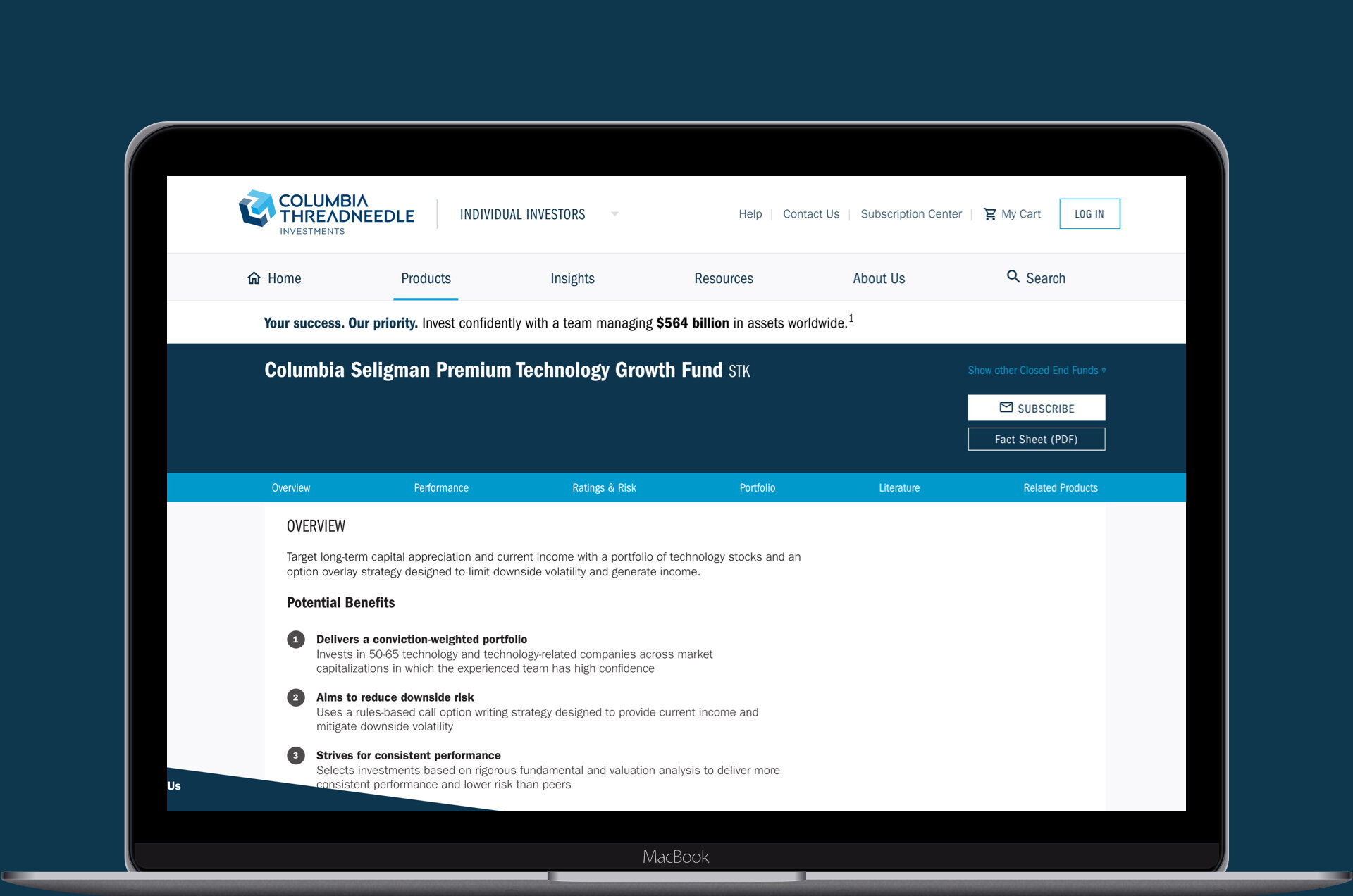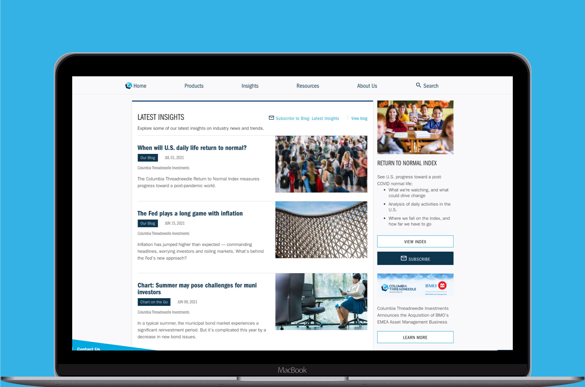
Columbia Threadneedle
Building out a more robust design system and developing accessible experiences for all users were priorities for this global financial investment firm.

Summary
A collaborative effort that initially started as a side project amongst four people led to vast global changes across an entire financial investment website entity. Our team contributed to establishing a more robust design system and set forth a point of view on how the organization should approach WCAG 2.1 compliance for their digital products. Continual iterations are still happening, but this case study focuses on the initial stages of work during my time on the project.
Background
Client
Spanning across 17 countries globally, Columbia Threadneedle is a collective force of over 2,000 individuals, including 450 investment professionals. Collaborating seamlessly across the world, they manage a portfolio exceeding $564 billion in investments for individual investors, financial advisors, and wealth managers.
Team
Key stakeholders
Product Owners
Product Designer (colleague)
Product Designer (me)
Frontend Web Developers
My role as a Product Designer
Audit - accessibility
Audit - UI design components
Typography
Color palette
Visual design
High-fidelity mockups
Client presentations
Problem
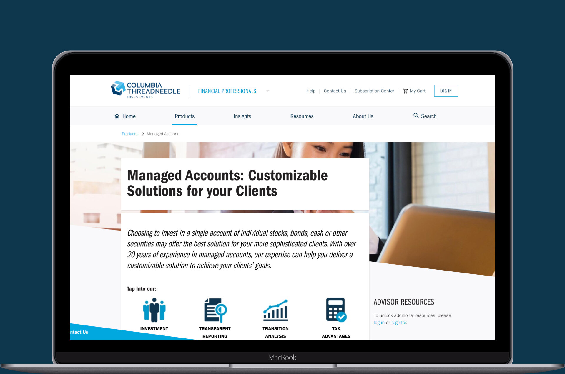
The legacy Columbia Threadneedle website, which was several years old, was in need of an overdue tune-up
The site lacked a robust design system, which led to many UI/UX inconstancies across the entire site
The site wasn't WCAG 2.1 compliant and featured many areas of opportunity for enhancements
Solution
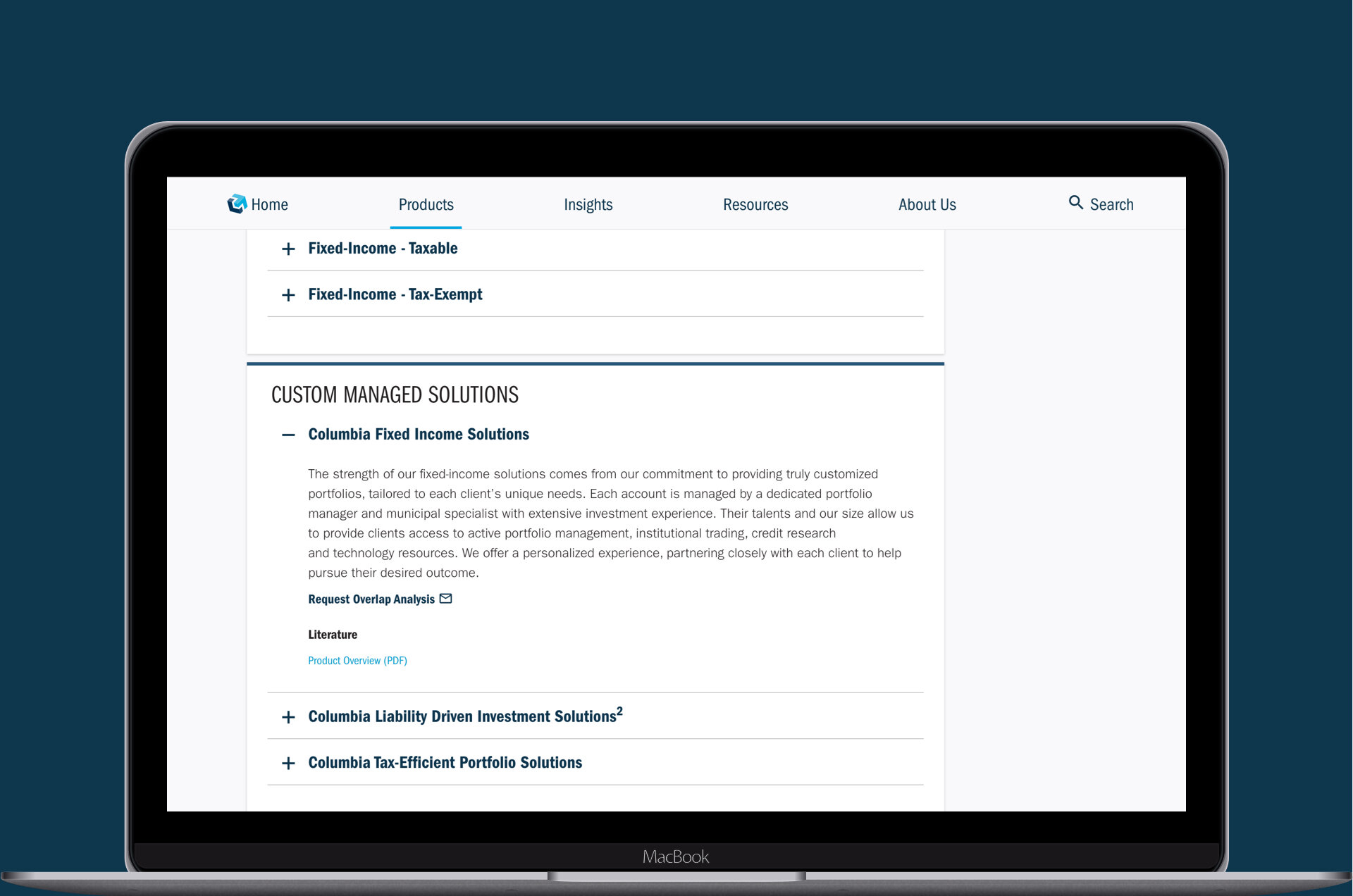
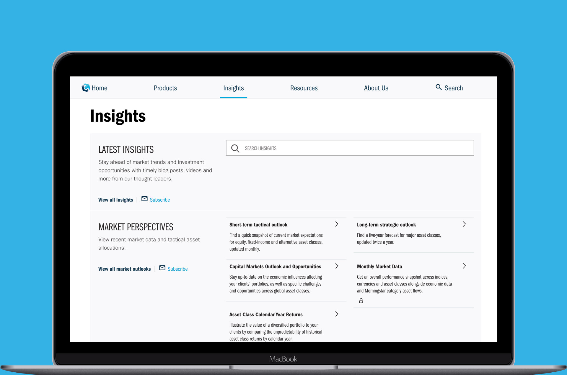
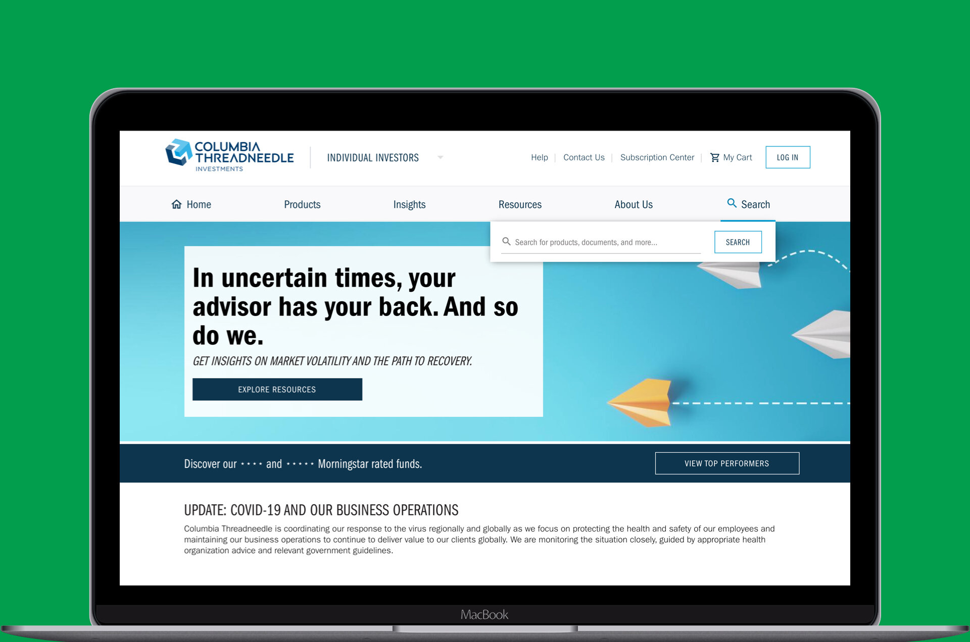
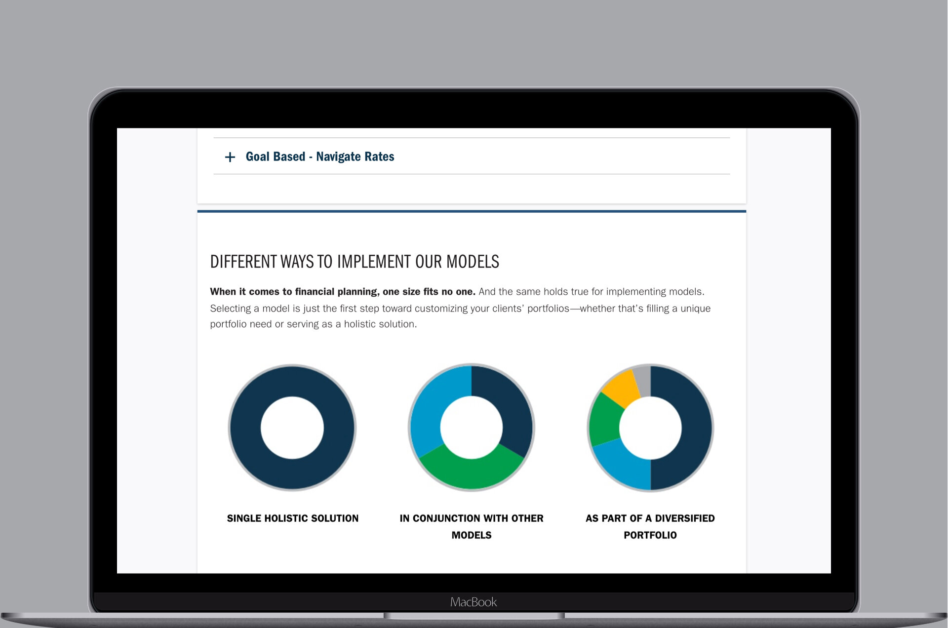
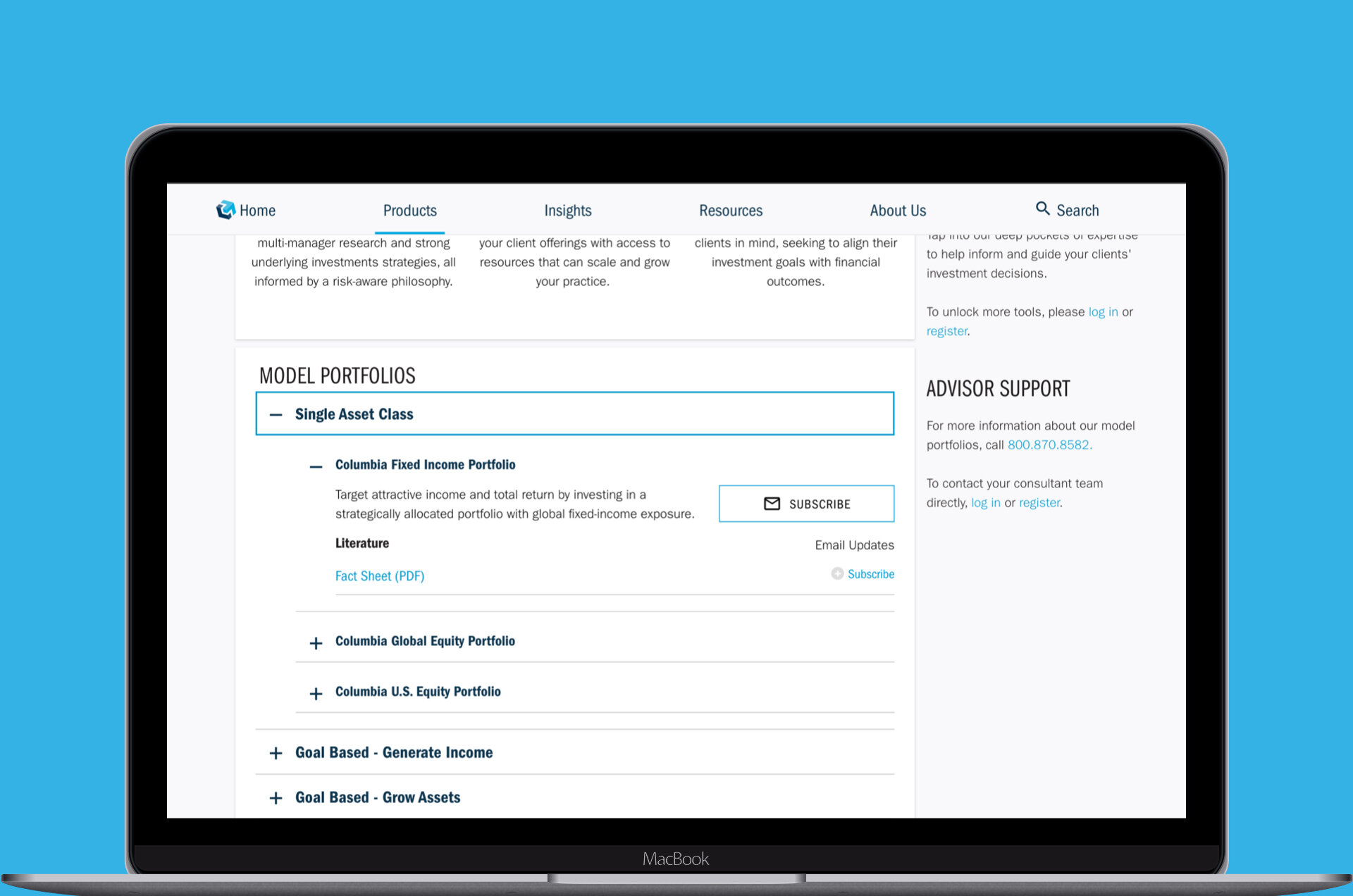
Our team developed various additions to the CTI design system, some of which included: updated typography standards, an accessible friendly color palette, a set of standardized buttons, an ornamental and functional icon library, data visualization color standards, and much more. Through the newly enhanced design system, it not only created a more consistent UI/UX experience for customers, it also created greater time/cost efficiencies for the design and web development teams. In addition, our team implemented WCAG 2.1 compliance for the CTI personal investor website, as well as other digital products.
Discovery
What initially started as a quick review of a small section of the legacy website, quickly expanded into a much larger effort after it became apparent the issues we noticed were much more widespread than we originally thought.
Audit - Color and Typography
Through our investigation, we discovered the CTI individual investor website featured over 100 unique font colors and background colors, many of which were not WCAG 2.1 AA compliant. Additionally, we discovered hundreds of variations of font sizes, font families, line heights, font weights, text decorations, and text alignments.
Audit - Iconography
In reviewing the usage of icons throughout the website, we documented a vast assortment of inconsistencies in terms of visual style, size, and color. The work-in-progress CTI design system (at the time) featured very few icons, some of which were outdated.
Audit - Accessibility - Keyboard
Our web developer colleagues uncovered issues with tab focus areas that weren't always visible, nor well defined in form input fields. Also, many unnecessary tabs impeded navigation, and backward tabbing was blocked by the sticky navigation.
Delivery
After several meetings and presentations with product owners, leadership, and other key stakeholders, we received approval to move forward with a stepped approach to making all of the enhancements our team recommended.
Color and Typography
To correct the widespread color and typography inconsistencies, we performed the following:
Consolidated the colors and fonts to eliminate variations, which led to a consistent application of the CTI digital brand colors and fonts
Achieved WCAG 2.1 AA compliance through modifications in the CTI digital brand colors and fonts
Aligned the implementation of the CTI colors and fonts to work within the broader Ameriprise design system
The color and font code base was simplified to reduce the potential for errors/inconsistencies and to create greater efficiencies
A unified, accent color palette for data visualizations was created
Icons
To correct the iconography gaps, we performed the following:
Created site-wide consistency through streamlining and optimizing the decorative icon library
Aligned functional icons to Google Material Design standards
Added a new set of icons to the CTI design system
Accessibility - Keyboard
To solve the keyboard accessibility issues, our web developers cleaned up the ARIA labels and focused states, consolidated the code base, and ensured keyboard tabbing was an efficient navigation experience.
Conclusion
Results
Although making design system updates and achieving WCAG 2.1 compliance should always be ongoing efforts, our team was able to transform our observations into reality and establish a strong foundation on which to build upon in the future. Even though our work wasn't an official initiative on the product roadmap, CTI leadership and key stakeholders quickly discovered this effort made sense for both the business and clients.
Lessons Learned
A team vision can become a reality. One never knows how far an idea can go unless you try. Our team was able to prioritize and develop a plan to implement our recommendations in a short amount of time.
Get out of the way and let people do what they love and know best. Our flat team structure and dedication to the work brought out the best in all of us to accomplish what we envisioned, without any shortcuts.

